DOEER branding
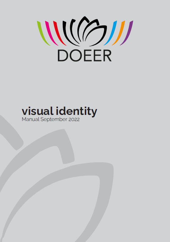
All DOEER outputs and results are designed to be freely used. We will be pleased if only the DOEER logo and web adddress www.doeer.eu will be quoted. The logo is the core component of the project visual identity and combines different symbols to represent the DOEER scopes. The lotus flower, commonly recognized as symbol for rebirth and strength, stands for the central concept of ‘resilience’. The lotus petals also graphically recall the pages of a book, thus evoking ‘study and learning’. Colored elements literally incorporate the lotus, giving shape to the ‘inclusive’ approach of the project. The colored elements are all of identical dimension and shape, thus representing ‘equality’, but they are also of different colors, as symbols of harmonized diversities. In order to ensure the achievement of the visual impact expected, the rules described in the DOEER Visual Identity manual should be respected any time partners or stakeholders use the DOEER logo. The correct use of the DOEER logo is broadly encouraged.
DOEER Visual Identity manual